Lawrence Livermore National Laboratory’s (LLNL’s) latest annual energy flow chart suggests that in 2019, for the second year in a row, wind and solar made up the largest increases in U.S. energy supply, but American consumption of energy fell after a record year in 2018.
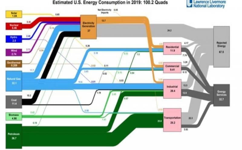
The national lab’s annual U.S. energy flow chart, or Sankey diagram, is a much-cited single-page reference that compares fuels and their consumption on a common energy unit basis and provides a comprehensive picture of the nation’s energy supply and consumption. LLNL also publishes energy flow charts for each state, as well as carbon (or carbon dioxide potential) flow and water flow at the national, state, municipal, and organizational levels. The lab says the charts are used by scientists, analysts, and other decision-makers to visualize the complex interrelationships involved in managing our nation’s resources.
The 2019 U.S. Energy Flow Chart, released April 8, is based on data from the Energy Department and the Energy Information Administration. It estimates that Americans last year used 100.2 quadrillion (quads) British thermal units (Btu; 3,412 Btu are equivalent to about 1 kWh)—slightly lower than the total 101.2 quads consumed in 2018. According to the lab, in 2018 Americans used more energy than in any other year, surpassing the previous record set in 2007, of 101.0 quads.
In 2019, about 37% (37 quads) of the 100.2-quad total was used for power generation, markedly lower than the 38.2 quads used in 2018. In 2012, by comparison, the generation sector consumed about 40% or 38.1 quads of total energy.
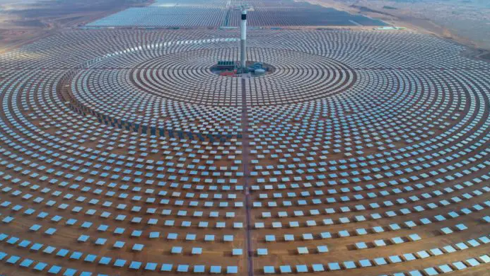
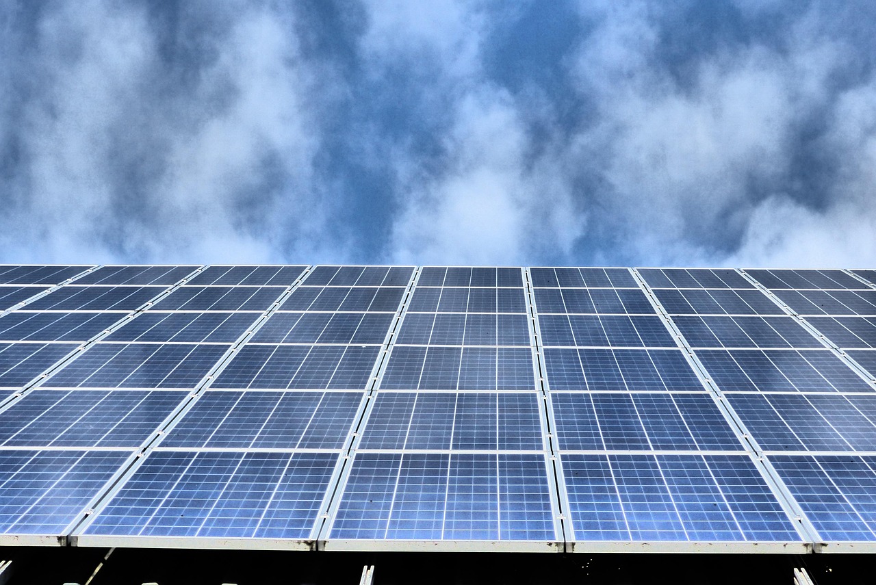
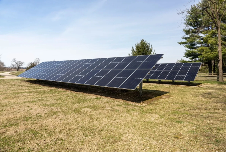
Continuing a trend first observed in 2018, in 2019, the largest increases in energy supply came from natural gas, wind and solar energy, with jumps of 4%, 10% and 8%, respectively. “Solar energy supply exceeded 1 quad for the first time ever as more users turned to renewables. Wind and solar combined now produce more electricity than hydroelectric power, which dominated renewable energy for decades,” the lab noted.
“Solar and wind continue to show year-on-year growth, which is an impressive change for the energy system,” said A.J. Simon, associate program leader for Water Security and Technologies at LLNL. “Other energy resources, such as hydropower, nuclear energy and geothermal have trended flat over the past decade, despite visible annual fluctuations.”
Coal use was down in 2019 by 1.9 quads—or 14%—mostly in the power generation sector, owing mainly to an increase for natural gas. “This reflects a significant change to electricity generation, where gas continues to displace coal,” Simon noted.
LLNL’s Sankey Diagrams are especially remarkable because they visualize the extent of wasted or “rejected” energy. As LLNL explains, “All energy use and conversion results in some losses.” Last year, 67.5 quads was rejected—1 quad less than in 2018 (which is about the same amount of solar energy consumed in 2019). That bucks a trend in which over the past five years, rejected energy has grown in tandem with increased energy use. In 2014, for example, total rejected energy stood at 59.4 quads.
The 2019 drop in rejected energy could be partly contributed to the shift from coal to more efficient gas generation. Rejected energy from power generation stood at 25.8 quads in 2014; it fell to 24.9 quads in 2016, 24.7 quads in 2017, but grew again to 25.3 quads in 2018. In 2019, it stood at 24.2 quads.
The bulk of rejected energy, however, typically takes the form of waste heat, “such as the warm exhaust from automobiles and furnaces. The efficiency of the nation’s cars, lightbulbs and factories determines how much waste heat is produced and how much fuel and electricity can be put to productive use,” LLNL said.